
Data-Driven Decision-Making in Justice Facilities: The Dawn of the Dashboard
In today’s jails, prisons, and courthouses, data is everywhere. From intake forms and booking logs to classification reports, disciplinary records, and sentencing files, justice agencies generate vast amounts of information every day. The real challenge is no longer how to gather this data – it’s how to make sense of it. How do we convert a deluge of disconnected spreadsheets and databases into actionable intelligence? For correctional administrators, the answer lies in making a commitment to data-driven decision-making – and more importantly, putting the right tools in place to support it. At the center of this shift is a practical, real-time solution: the operational dashboard.
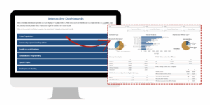
Data Visualization in Real Time
Images courtesy of https://doc.wi.gov/
The emergence of dashboards has revolutionized how correctional agencies interact with data. Rather than sifting through rows of Excel data or waiting for quarterly reports, leaders and frontline staff can now access real-time visual summaries of what’s happening in their facilities. These platforms display key performance metrics – like incident trends, bed space availability, and classification statuses – in one centralized location. With the click of a mouse, users can quickly understand where attention is needed most.
But a dashboard isn’t just a reporting tool. Done right, it becomes an operational command center. Dashboards enable agencies to transition from reactive to proactive decision-making, identifying and addressing problems before they escalate. One of the most promising features of modern dashboards is the ability to support real-time intervention. Rather than looking backward at problems that have already occurred, dashboards allow agencies to look ahead and act decisively.
Imagine a classification manager seeing a spike in risk scores for a particular intake cohort, prompting a review of programming availability… or a shift supervisor getting an alert when a housing unit exceeds a threshold for incidents, enabling additional staff deployment before conditions deteriorate. These are not hypothetical scenarios – they are the reality in facilities that have fully embraced data as an operational tool.
Real-time dashboards also enable leadership to respond quickly during emergencies. During the COVID-19 pandemic, for instance, many facilities used dashboards to track isolation units, testing rates, and population movement. This type of situational awareness is now becoming standard – not just for public health, but for daily operations.
Growing Public Trust Through Transparency
Another growing trend is the development of public-facing dashboards, which promote transparency and increase accountability. These tools allow community members, advocacy organizations, and the media to monitor key statistics – such as population levels, use of force, disciplinary actions, or programming participation.
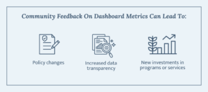
Public dashboards also serve as a counterbalance to misinformation or incomplete narratives. Instead of relying solely on external audits or press coverage, agencies can take ownership of their story by presenting accurate, timely data that illustrates progress – or highlights areas still needing improvement. Importantly, public dashboards also provide a feedback loop between the agency and the people it serves. In some jurisdictions, community feedback on dashboard metrics has led to policy changes, increased data transparency, and even new investments in programs or services.
Bringing Data to Life
Correctional systems have never been short on data. In fact, the problem is often having too much information scattered across too many places. Booking data may live in one system, while classification assessments are stored in another. Medical and mental health records might be siloed in yet another platform. Meanwhile, key decision-makers are left juggling multiple logins, waiting on IT, or relying on outdated data pulls just to answer basic operational questions.
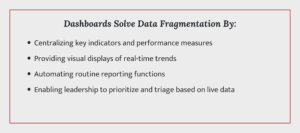
A well-designed dashboard solves this fragmentation problem by:
- Centralizing key indicators and performance measures in one accessible platform
- Providing visual displays of real-time trends (e.g., incidents, bed space, alerts)
- Automating routine reporting functions that otherwise consume staff time
- Enabling leadership to prioritize and triage based on live data
In short, dashboards bring data to life.
Optimizing Dashboards for a Clearer Picture of Your Data
According to national guidance from agencies like the National Institute of Corrections (NIC), dashboards are most effective when they’re designed with a clear operational purpose. That means knowing what you’re trying to achieve – and ensuring the dashboard supports it. Here are some practical ways agencies can get the most out of their dashboards:
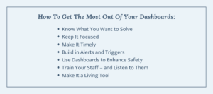
- Know What You Want to Solve
The best dashboards are built around specific decision points. Before you start designing your dashboard, ask, “What are the key decisions we need to support?” Is the goal to reduce time in restrictive housing? Improve classification accuracy? Monitor trends in use of force? Dashboards that support specific operational needs drive more targeted action.
- Keep It Focused
More isn’t always better. A cluttered dashboard becomes just another wall of noise. Instead, focus on high-impact indicators – such as average daily population, number of open mental health cases, frequency of assaults, or classification overrides. Think quality over quantity.
- Make It Timely
Stale data is dangerous data. A dashboard that’s updated weekly – or worse, monthly – may miss critical developments. Aim for daily (or even hourly) updates for high-risk metrics like suicide attempts, use of force, and bed availability. The more current the data, the more useful it is for real-time decision-making.
- Build in Alerts and Triggers
Dashboards should do more than just report. They should alert. Build in triggers that highlight when something is off – whether that’s overdue medical screenings, a spike in incidents on a certain unit, or repeated admissions from a specific zip code. These red flags can prompt early intervention and prevent harm.
- Use Dashboards to Enhance Safety
Safety – for both staff and incarcerated individuals – is a central goal. Dashboards can help track violence, contraband incidents, suicide attempts, and other safety-related events in real time. Heat maps and trend lines can help administrators identify hotspots, staffing needs, or training gaps.
- Train Your Staff – and Listen to Them
A dashboard is only as effective as the people using it. Staff training is essential, not just on how to read the dashboard, but on how to interpret and act on the data. It’s also important to create feedback loops. Ask, “What’s working? What’s not helpful?” Dashboards should evolve with frontline needs, not just top-down directives.
- Make It a Living Tool
Correctional priorities shift. So should dashboards. Build in regular review cycles – quarterly or semi-annually – to ensure your dashboard reflects current goals, processes, and policies. Be willing to change what you’re tracking if it’s no longer relevant.
Data Dashboards in Action
To better understand the transformative power of dashboards, let’s look at how some jurisdictions have put these tools to work:
Allegheny County, Pennsylvania: Jail Population Management
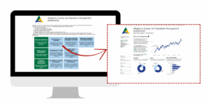
Images courtesy of https://alleghenycountyanalytics.us/
In Allegheny County, the Department of Human Services created a Jail Population Management Dashboard that provides real-time data on holding statuses, demographic trends, and population flows in and out of the facility. This dashboard helps stakeholders – from jail administrators to judges – understand population pressures and assess the impact of diversion, pretrial release, and court processing strategies. It’s a foundational tool in the county’s broader jail population reduction strategy.
Vermont Department of Corrections: Incarcerated Population Insights
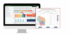
Images courtesy of https://doc.vermont.gov/
The Vermont DOC developed an Incarcerated Population Interactive Dashboard that displays detailed information on offense type, security level, mental health needs, and demographic breakdowns. With this level of transparency, both agency leaders and the public can monitor system trends over time. Importantly, this dashboard supports internal accountability while also enhancing public trust in the system.
Wisconsin Department of Corrections: Statewide Transparency
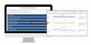
Images courtesy of https://doc.wi.gov/
Wisconsin has invested heavily in public-facing dashboards that cover a broad range of topics – from admissions and releases to demographic shifts and institutional incidents. These dashboards are highly customizable, allowing users to filter by age, race, institution, and offense. For internal staff, these tools help monitor trends and allocate resources. For advocates and researchers, they provide an invaluable source of system-wide transparency.
Michigan Courts: Judicial Performance Tracking

Images courtesy of https://www.courts.michigan.gov/
Michigan’s judiciary launched an Interactive Court Data Dashboard to give the public and stakeholders access to performance metrics across the state’s trial courts. The dashboard tracks clearance rates, pending caseloads, and processing times by court and case type. It’s a prime example of how dashboards can promote transparency, drive improvement, and support data-informed policy at the judicial level.
Beyond a Trend – The Benefits of Dashboards
Dashboards are more than a trend – they are a fundamental tool for justice system reform and operational excellence. As correctional agencies face growing scrutiny, budget constraints, and evolving public expectations, the ability to make fast, informed, and transparent decisions has never been more important.
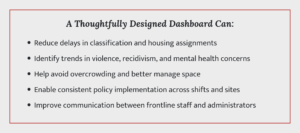
A thoughtfully designed dashboard can:
- Reduce delays in classification and housing assignments
- Identify trends in violence, recidivism, and mental health concerns
- Help avoid overcrowding and better manage space
- Enable consistent policy implementation across shifts and sites
- Improve communication between frontline staff and administrators
The dashboard becomes a shared language – one that bridges departments, clarifies priorities, and supports both immediate needs and long-term planning.
Common Challenges of Dashboards
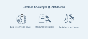
That said, dashboard implementation isn’t without its challenges. Common obstacles include:
- Data integration issues: Merging siloed data from legacy systems takes time and expertise.
- Resource limitations: Smaller facilities may lack the internal IT or analytics staff to build and maintain custom dashboards.
- Resistance to change: Staff may be wary of new tools, especially if they fear they’ll be used for monitoring rather than support.
These are real barriers – but they are not insurmountable. Some agencies have overcome them by starting small, using off-the-shelf solutions, or partnering with universities or nonprofit research groups. The key is to treat the dashboard as a tool for empowerment, not surveillance.
Actionable Steps to Kickstart Your Dashboard Journey
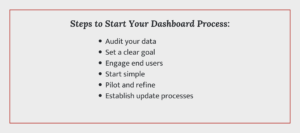
Building a dashboard doesn’t require a six-figure budget or a full-time team of developers. Many agencies start small – choosing a handful of high-priority indicators and developing basic visualizations using tools like Microsoft Power BI, Tableau, or even Google Data Studio. Others partner with local universities, technical assistance providers, or software vendors.
Here are a few steps agencies can take to begin the process:
- Audit your data: Understand what data you have, how accurate it is, and where it’s stored.
- Set a clear goal: Decide what the dashboard is meant to support. Don’t try to track everything at once.
- Engage end users: Include frontline staff, administrators, and stakeholders in the design process.
- Start simple: Choose five to ten metrics to track, and build from there.
- Pilot and refine: Roll out your dashboard to a small group and collect feedback before going agency-wide.
- Establish update processes: Ensure data is refreshed regularly and automatically wherever possible.
Even a modest dashboard, if built thoughtfully, can dramatically improve how decisions are made and how quickly facilities can respond to pressing needs.
In the End, It’s About Much More Than Just Numbers

A dashboard isn’t just a bunch of charts. It’s a tool for running safer, smarter, and more transparent correctional systems. When it’s designed with purpose and built around the day-to-day needs of the facility, it turns scattered data into insight – and insight into action.
The examples from Allegheny County, Vermont, Wisconsin, and Michigan show that dashboards are not a luxury. They are a necessity. Correctional systems are beginning to see that in order to meet today’s challenges – overcrowding, rising mental health needs, staff burnout, and public accountability – they need tools that can turn raw data into operational intelligence.
We are entering a new era where real-time information isn’t a “nice-to-have” – it’s the backbone of how justice agencies function. At the center of that shift is the dashboard: simple, powerful, and transformative.
Download the PDF
Meet the Author